

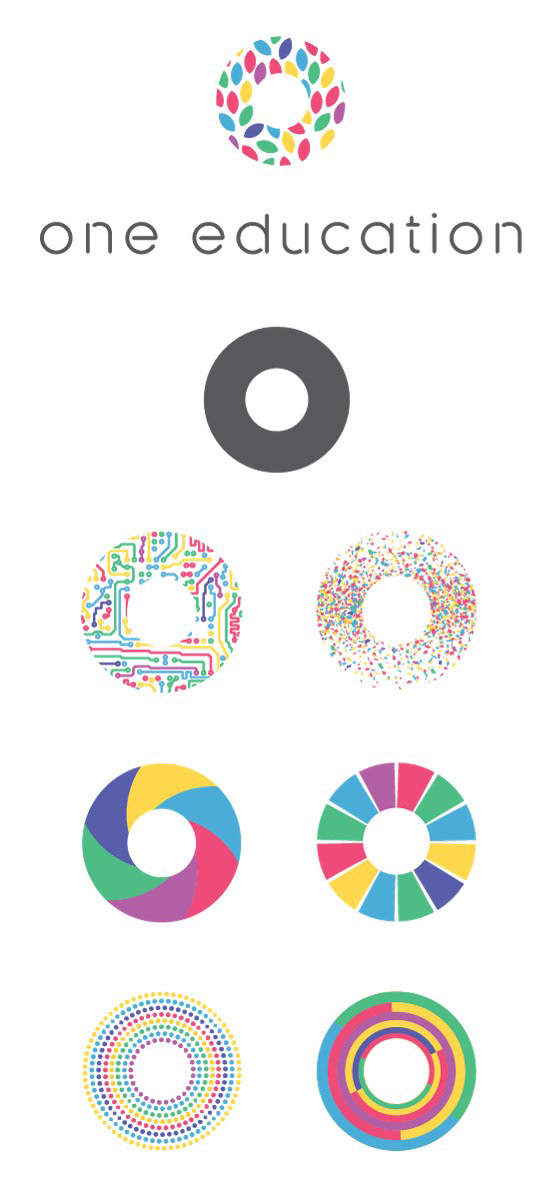
Logo variants for One Education
SUMMARY
As One Education entered a new phase of its life, it was time to re-brand. No longer a formal arm of the One Laptop per Child organisation, a new symbol was required.
As a foundation that is centred on one key mission (close the digital divide), but impacts its users in many different ways (technology, opportunity, education, play) the circle was an obvious choice. Representing the O, the concept of one whole, and most importantly having a solid and flexible silhouette that could be used fun and creative ways.
Embracing a strong and simple shape, allowed the One Education to playfully incorporate the logo throughout its branding and adjust it to fit projects as required.
MY INVOLVEMENT
Project owner and manager
Creative and art direction
Some visual design
Creative and art direction
Some visual design
3RD PARTY INVOLVEMENT
I worked with the fantastic Dan Marshall to bring my hopes for a One Education modular brand identity to life with a very quick turn around time.